(dead link removal) |
No edit summary |
||
| (5 intermediate revisions by 2 users not shown) | |||
| Line 25: | Line 25: | ||
| type = style | | type = style | ||
| small = left | | small = left | ||
| image = [[File:Emblem-question-yellow. | | image = [[File:Emblem-question-yellow.png|40px|alt=Question mark]] | ||
| smallimage = [[File:Emblem-question-yellow. | | smallimage = [[File:Emblem-question-yellow.png|20px|alt=Question mark]] | ||
| textstyle = color: red; font-weight: bold; font-style: italic; | | textstyle = color: red; font-weight: bold; font-style: italic; | ||
| text = Text for a big box, for the top of articles. | | text = Text for a big box, for the top of articles. | ||
| Line 36: | Line 36: | ||
| type = style | | type = style | ||
| small = left | | small = left | ||
| image = [[File:Emblem-question-yellow. | | image = [[File:Emblem-question-yellow.png|40px|alt=Question mark]] | ||
| smallimage = [[File:Emblem-question-yellow. | | smallimage = [[File:Emblem-question-yellow.png|20px|alt=Question mark]] | ||
| textstyle = color: red; font-weight: bold; font-style: italic; | | textstyle = color: red; font-weight: bold; font-style: italic; | ||
| text = Text for a big box, for the top of articles. | | text = Text for a big box, for the top of articles. | ||
| Line 84: | Line 84: | ||
{{ambox | {{ambox | ||
| type = content | | type = content | ||
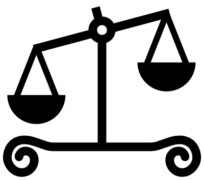
| image = [[File:Unbalanced scales. | | image = [[File:Unbalanced scales.png|40px|link=|alt=]] | ||
| text = type = content <br> image = <nowiki>[[File:Unbalanced scales. | | text = type = content <br> image = <nowiki>[[File:Unbalanced scales.png|40px|link=|alt=]]</nowiki> <br> This image is often used for {{tl|POV}} and similar issues. | ||
}} | }} | ||
{{ambox | {{ambox | ||
| type = move | | type = move | ||
| image = [[File:Merge-arrows. | | image = [[File:Merge-arrows.png|50px|link=|alt=]] | ||
| text = type = move <br> image = <nowiki>[[File:Merge-arrows. | | text = type = move <br> image = <nowiki>[[File:Merge-arrows.png|50px|link=|alt=]]</nowiki> <br> This image is used for {{tl|merge}} etc. | ||
}} | }} | ||
| Line 111: | Line 106: | ||
{{ambox | {{ambox | ||
| image = [[File:Gnome globe current event. | | image = [[File:Gnome globe current event.png|42px|alt=Clock over a larger globe]] | ||
| imageright = [[File:Nuvola apps bookcase. | | imageright = [[File:Nuvola apps bookcase.png|40px|alt=Three stacked books]] | ||
| text = image = <nowiki>[[File:Gnome globe current event. | | text = image = <nowiki>[[File:Gnome globe current event.png|42px|alt=Clock over a larger globe]]</nowiki> <br> imageright = <nowiki>[[File:Nuvola apps bookcase.png|40px|alt=Three stacked books]]</nowiki> | ||
}} | }} | ||
{{ambox | {{ambox | ||
| image = [[File:Gnome globe current event. | | image = [[File:Gnome globe current event.png|42px|alt=Clock over a larger globe]] | ||
| imageright = [[File:Shuttle. | | imageright = [[File:Shuttle.png|20px|link=|alt=]] | ||
| text = '''This article or section documents a current | | text = '''This article or section documents a current spaceflight.''' | ||
<br>Content may change as the mission progresses. | <br>Content may change as the mission progresses. | ||
}} | }} | ||
| Line 149: | Line 144: | ||
:'''An image''' = Should be an image with usual wiki notation. Widths of 40px - 50px are usually about right. (Images over 52 pixels wide will cause padding problems.) | :'''An image''' = Should be an image with usual wiki notation. Widths of 40px - 50px are usually about right. (Images over 52 pixels wide will cause padding problems.) | ||
:: Often an icon is [[Wikipedia:Alternative text for images#Purely decorative images|purely decorative]] in the W3C sense that it repeats the text. To improve [[Wikipedia:Accessibility|accessibility]], it is desirable to not have it be announced by [[screen reader]]s, as well as to avoid it linking to an irrelevant page. If (and only if) the image license allows this, it can be marked with "{{para|link}}{{para|alt}}". For example: | :: Often an icon is [[Wikipedia:Alternative text for images#Purely decorative images|purely decorative]] in the W3C sense that it repeats the text. To improve [[Wikipedia:Accessibility|accessibility]], it is desirable to not have it be announced by [[screen reader]]s, as well as to avoid it linking to an irrelevant page. If (and only if) the image license allows this, it can be marked with "{{para|link}}{{para|alt}}". For example: | ||
:::<code><nowiki>image = [[File:Unbalanced scales. | :::<code><nowiki>image = [[File:Unbalanced scales.png|40px|link=|alt=]]</nowiki></code> | ||
:: Conversely, an icon that does not use "{{para|link}}{{para|alt}}", and which therefore is announced to visually impaired readers, should use an "{{para|alt|<var>[[Wikipedia:Alternative text for images|alt text]]</var>}}" parameter that describes the icon. With no {{para|link}} parameter (using the default link), the alt text should describe the icon's visual appearance. For example: | :: Conversely, an icon that does not use "{{para|link}}{{para|alt}}", and which therefore is announced to visually impaired readers, should use an "{{para|alt|<var>[[Wikipedia:Alternative text for images|alt text]]</var>}}" parameter that describes the icon. With no {{para|link}} parameter (using the default link), the alt text should describe the icon's visual appearance. For example: | ||
:::<code><nowiki>image = [[File:Gnome globe current event. | :::<code><nowiki>image = [[File:Gnome globe current event.png|40px|alt=Clock over a larger globe]]</nowiki></code> | ||
:: With a nonempty "{{para|link|<var>Page</var>}}" the alt text should describe the icon's function. For example: | :: With a nonempty "{{para|link|<var>Page</var>}}" the alt text should describe the icon's function. For example: | ||
:::<code><nowiki>image = [[File:Purple question mark. | :::<code><nowiki>image = [[File:Purple question mark.png|40px|link=Special:Random|alt=Random article]]</nowiki></code> | ||
:: An icon whose license requires attribution may have alt text, but ''must keep the default link''. Although public domain images do not require a link, many licenses do require one. Please see ''[[Wikipedia:Alternative text for images#Purely decorative images|Purely decorative images]]'' for more information about licensing. | :: An icon whose license requires attribution may have alt text, but ''must keep the default link''. Although public domain images do not require a link, many licenses do require one. Please see ''[[Wikipedia:Alternative text for images#Purely decorative images|Purely decorative images]]'' for more information about licensing. | ||
:'''none''' = Means that no image is used. | :'''none''' = Means that no image is used. | ||
| Line 165: | Line 160: | ||
'''style''' | '''style''' | ||
:Optional [[Cascading Style Sheets|CSS]] values used by the entire message box table. Without quotation marks <code>" "</code> but with the ending semicolons <code>;</code>. For example: | :Optional [[Wikipedia:Cascading Style Sheets|CSS]] values used by the entire message box table. Without quotation marks <code>" "</code> but with the ending semicolons <code>;</code>. For example: | ||
::<code>style = margin-bottom: 0.5em;</code> | ::<code>style = margin-bottom: 0.5em;</code> | ||
'''textstyle''' | '''textstyle''' | ||
:Optional [[Cascading Style Sheets|CSS]] values used by the text cell. For example: | :Optional [[Wikipedia:Cascading Style Sheets|CSS]] values used by the text cell. For example: | ||
::<code>textstyle = text-align: center;</code> | ::<code>textstyle = text-align: center;</code> | ||
| Line 195: | Line 190: | ||
:'''No parameter''' = If no '''smallimage''' parameter is given then this template falls back to use the '''image''' parameter. If the '''image''' parameter also is empty then a small default image is used. | :'''No parameter''' = If no '''smallimage''' parameter is given then this template falls back to use the '''image''' parameter. If the '''image''' parameter also is empty then a small default image is used. | ||
:'''An image''' = Should be an image with usual wiki notation. 20px width is usually about right for boxes with one line of text, while 25px width is usually about right for boxes with two lines of text. For example: | :'''An image''' = Should be an image with usual wiki notation. 20px width is usually about right for boxes with one line of text, while 25px width is usually about right for boxes with two lines of text. For example: | ||
::<code><nowiki>smallimage = [[File:Gnome globe current event. | ::<code><nowiki>smallimage = [[File:Gnome globe current event.png|20px|alt=Clock over a larger globe]]</nowiki></code> | ||
:'''none''' = Means that no image is used. This overrides any image fed to '''image''', when "small=left". | :'''none''' = Means that no image is used. This overrides any image fed to '''image''', when "small=left". | ||
{{ambox | {{ambox | ||
| small = left | | small = left | ||
| image = [[File:Replacement filing cabinet. | | image = [[File:Replacement filing cabinet.png|50px|link=|alt=]] | ||
| smallimage = [[File:Replacement filing cabinet. | | smallimage = [[File:Replacement filing cabinet.png|25px|link=|alt=]] | ||
| text = | | text = | ||
small = left <br> image = <nowiki>[[File:Replacement filing cabinet. | small = left <br> image = <nowiki>[[File:Replacement filing cabinet.png|50px|link=|alt=]]</nowiki> <br> smallimage = <nowiki>[[File:Replacement filing cabinet.png|25px|link=|alt=]]</nowiki> | ||
}} | }} | ||
| Line 213: | Line 208: | ||
{{ambox | {{ambox | ||
| small = left | | small = left | ||
| imageright = [[File:Gnome globe current event. | | imageright = [[File:Gnome globe current event.png|50px|alt=Clock over a larger globe]] | ||
| smallimageright = none | | smallimageright = none | ||
| text = | | text = | ||
small = left <br> imageright = <nowiki>[[File:Gnome globe current event. | small = left <br> imageright = <nowiki>[[File:Gnome globe current event.png|50px|alt=Clock over a larger globe]]</nowiki> <br> smallimageright = none | ||
}} | }} | ||
| Line 257: | Line 252: | ||
=== See also === | === See also === | ||
Other pages: | Other pages: | ||
| Line 264: | Line 257: | ||
* [[Wikipedia:Article message boxes]] – The style guideline for creating article message boxes at wikipedia. | * [[Wikipedia:Article message boxes]] – The style guideline for creating article message boxes at wikipedia. | ||
<!-- * [[Wikipedia talk:Article message boxes]] – For discussion about these matters. --> | <!-- * [[Wikipedia talk:Article message boxes]] – For discussion about these matters. --> | ||
Latest revision as of 19:24, 22 May 2013
 |
This is a documentation subpage for Template:Ambox. It contains usage information, categories and other content that is not part of the original template page. |
 Message box templates Message box templates |
{{ambox}} • {{asbox}} • {{cmbox}} • {{dmbox}} • {{fmbox}} • {{imbox}} • {{ombox}} • {{tmbox}} |
|---|
This is the {{ambox}} or article message box meta-template.
It is used to build article message box templates such as {{wikify}}. It offers several different colours, uses default images if no image parameter is given and it has some other features.
This meta-template uses the ambox CSS classes in MediaWiki:Common.css. The classes can also be used directly in a wikitable if special functionality is needed. See the how-to guide for that.
Usage
Simple usage example:
{{ambox | text = Some text.}}
 |
Some text. |
Complex example:
{{ambox
| type       = style
| small      = left
| image      = [[File:Emblem-question-yellow.png|40px|alt=Question mark]]
| smallimage = [[File:Emblem-question-yellow.png|20px|alt=Question mark]]
| textstyle  = color: red; font-weight: bold; font-style: italic;
| text       = Text for a big box, for the top of articles.
| smalltext  = Text for the top of article sections.
}}
 |
Text for the top of article sections. |
But you are not really supposed to use red bold italic text.
Article message box types
The following examples use different type parameters but use no image parameters thus they use the default images for each type.
 |
type=speedy – Speedy deletion issues, such as {{db-g1}} and {{db-g3}}. |
 |
type=delete – Deletion issues, such as {{afd}} and {{prod}}. |
 |
type=content – Content issues, such as {{POV}} and {{globalize}}. |
 |
type=style – Style issues, such as {{cleanup}} and {{wikify}}. |
|
type=notice – Article notices, such as {{current}} and {{inuse}}. |
 |
type=move – Merge, split and transwiki proposals, such as {{split}} and {{copy to wiktionary}}. |
 |
type=protection – Protection notices, such as {{pp-vandalism}} and {{pp-semi-protected}}. |
Other images
The default images shown above are mostly for convenience. In many cases it is more appropriate to use more specific images. These examples use the image parameter to specify an image other than the default images.
 |
type = content image = [[File:Unbalanced scales.png|40px|link=|alt=]] This image is often used for {{POV}} and similar issues. |
 |
type = move image = [[File:Merge-arrows.png|50px|link=|alt=]] This image is used for {{merge}} etc. |
More examples
Some other parameter combinations.
|
No type and no image given (default) |
| No type and image=none – No image is used and the text uses the whole message box area. |
 |
image = [[File:Gnome globe current event.png|42px|alt=Clock over a larger globe]] imageright = [[File:Nuvola apps bookcase.png|40px|alt=Three stacked books]] |
 |
|
This article or section documents a current spaceflight.
Content may change as the mission progresses. |
 |
Parameters
List of all parameters:
{{ambox
| type  = speedy / delete / content / style / notice / move / protection
| image = none / [[File:...|40px|...]]
| imageright = [[File:...|40px|...]]
| style = CSS values
| textstyle = CSS values
| text  = The message body text.
| small = {{{small|}}} / left
| smallimage = none / [[File:...|20px|...]]
| smallimageright = none / [[File:...|20px|...]]
| smalltext  = A shorter message body text.
}}
type
- If no type parameter is given the template defaults to type notice. That means it gets a blue side bar.
image
- No parameter = If no image parameter is given the template uses a default image. Which default image it uses depends on the type parameter.
- An image = Should be an image with usual wiki notation. Widths of 40px - 50px are usually about right. (Images over 52 pixels wide will cause padding problems.)
- Often an icon is purely decorative in the W3C sense that it repeats the text. To improve accessibility, it is desirable to not have it be announced by screen readers, as well as to avoid it linking to an irrelevant page. If (and only if) the image license allows this, it can be marked with "
|link=|alt=". For example:image = [[File:Unbalanced scales.png|40px|link=|alt=]]
- Conversely, an icon that does not use "
|link=|alt=", and which therefore is announced to visually impaired readers, should use an "|alt=alt text" parameter that describes the icon. With no|link=parameter (using the default link), the alt text should describe the icon's visual appearance. For example:image = [[File:Gnome globe current event.png|40px|alt=Clock over a larger globe]]
- With a nonempty "
|link=Page" the alt text should describe the icon's function. For example:image = [[File:Purple question mark.png|40px|link=Special:Random|alt=Random article]]
- An icon whose license requires attribution may have alt text, but must keep the default link. Although public domain images do not require a link, many licenses do require one. Please see Purely decorative images for more information about licensing.
- Often an icon is purely decorative in the W3C sense that it repeats the text. To improve accessibility, it is desirable to not have it be announced by screen readers, as well as to avoid it linking to an irrelevant page. If (and only if) the image license allows this, it can be marked with "
- none = Means that no image is used.
blank= This parameter is now deprecated. If you see it in use, change it to "image=none".
imageright
- No parameter = If no imageright parameter is given then no image is shown on the right side.
- An image = Should be an image with usual wiki notation. 40px - 50px width are usually about right depending on the image height to width ratio. (Images over 52 pixels width will cause padding problems.) For example:
imageright = [[File:Nuvola apps bookcase.png|40px|alt=Three stacked books]]
- Anything = Any other object that you want to show on the right side.
style
- Optional CSS values used by the entire message box table. Without quotation marks
" "but with the ending semicolons;. For example:style = margin-bottom: 0.5em;
textstyle
- Optional CSS values used by the text cell. For example:
textstyle = text-align: center;
text
- The message body text.
The small parameters
The small article message boxes are meant for the top of sections. Normally they should only contain one or two lines of text.
small
- left = Makes it a smaller left aligned message box. This also makes the default images smaller. Note that any data fed to the smallimage, smallimageright and smalltext parameters is only used if "small=left". To make it so your template also understands the small parameter you can use this code:
small = {{{small|}}}
|
|
small = left |
|
|
type = style small = left |
smallimage
- No parameter = If no smallimage parameter is given then this template falls back to use the image parameter. If the image parameter also is empty then a small default image is used.
- An image = Should be an image with usual wiki notation. 20px width is usually about right for boxes with one line of text, while 25px width is usually about right for boxes with two lines of text. For example:
smallimage = [[File:Gnome globe current event.png|20px|alt=Clock over a larger globe]]
- none = Means that no image is used. This overrides any image fed to image, when "small=left".
 |
small = left image = [[File:Replacement filing cabinet.png|50px|link=|alt=]] smallimage = [[File:Replacement filing cabinet.png|25px|link=|alt=]] |
smallimageright
- No parameter = If no smallimageright parameter is given then this template falls back to use the imageright parameter. If the imageright parameter also is empty then no image is shown on the right side.
- An image = Should be an image with usual wiki notation. 20px - 25px width is usually about right. For example:
smallimageright = [[File:Nuvola apps bookcase.png|20px|alt=Three stacked books]]
- Anything = Any other object that you want to show on the right side.
- none = Means that no right side image is used. This overrides any image fed to imageright, when "small=left".
|
|
small = left imageright = [[File:Gnome globe current event.png|50px|alt=Clock over a larger globe]] smallimageright = none |
smalltext
- A shorter version of the message body text. If no smalltext parameter is given then this template falls back to use the text parameter.
Technical details
If you need to use special characters in the text parameter then you need to escape them like this:
{{ambox
| text = <div>
Equal sign = and a start and end brace { } work fine as they are.
But here is a pipe | and two end braces <nowiki>}}</nowiki>.
And now a pipe and end braces <nowiki>|}}</nowiki>.
</div>
}}
|
Equal sign = and a start and end brace { } work fine as they are. But here is a pipe | and two end braces }}. And now a pipe and end braces |}}. |
The <div> tags that surround the text in the example above are usually not needed. But if the text contains line breaks then sometimes we get weird line spacing. This especially happens when using vertical dotted lists. Then use the div tags to fix that.
This template uses CSS classes in MediaWiki:Common.css for most of its looks, thus it is fully skinnable.
This template calls {{ambox/core}} which holds most of the code for {{ambox}}, while {{ambox}} itself does parameter preprocessing.
Internally this meta-template uses HTML wikimarkup instead of wikimarkup for the table code. That is the usual way we make meta-templates since wikimarkup has several drawbacks. For instance it makes it harder to use parser functions and some special characters in parameters.
The default images for this meta-template are in png format instead of svg format. The main reason is that some older web browsers have trouble with the transparent background that MediaWiki renders for svg images. The png images here have hand optimised transparent background colour so they look good in all browsers. Note that svg icons only look somewhat bad in the old browsers, thus such hand optimisation is only worth the trouble for very widely used icons.
For more technical details see the "See also" links below. Since this template works almost exactly like {{tmbox}}, {{imbox}}, {{cmbox}} and {{ombox}} their related pages might also contain more details.
See also
Other pages:
- Wikipedia:Ambox CSS classes – Describes how to use the ambox CSS classes directly in wikitables and HTML tables.
- Wikipedia:Article message boxes – The style guideline for creating article message boxes at wikipedia.